はじめに
animationプロパティを用いて
CSSでアニメーションをつくる方法(前回のおさらい)
- transitionプロパティを使用する → 比較的簡易なアニメーション
- animationプロパティ(@keyframes)を → 複雑なアニメーション
※animationプロパティは一見複雑に見えますがtransitionプロパティを使ったアニメーションが分かると、理解がかなりスムーズになると思います。今回はtransitionプロパティを用いたアニメーションの解説を行います。
transitionの例
animation(@keyframse)の例
まずはメインビジュアルをつくってみる
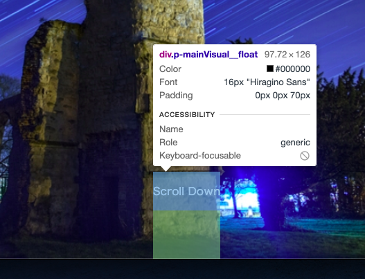
キャプチャのようにウインドウ一杯に画像が広がるようなメインビジュアルを作成します。
- 高さをheight:100vhにする
- 幅はwidth:100%
- 画像要素(imgタグ)に対して、object-fit:coverを設定して画像縦横比を固定させる
【HTML】
<div class="p-mainVisual">
  <div class="p-mainVisual__body">
    <img class="p-mainVisual__img" src="https://placeimg.com/1000/600/arch" alt="">
  </div>
</div>
【CSS】
body{
margin: 0;
}
.p-mainVisual{
position: relative;
height: 100vh;
}
.p-mainVisual__body{
height: 100%;
}
.p-mainVisual__img{
width: 100%;
height: 100%;
object-fit: cover;
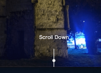
}スクロールアイコンを設置する
- pタグで「Scroll Down」のテキストを作成
- 擬似要素で円と棒線を作成
【HTML】
<div class="p-mainVisual">
  <div class="p-mainVisual__body">
    <img class="p-mainVisual__img" src="https://placeimg.com/1000/600/arch" alt="">
  </div>
  <!-- ↓ここから追加 -->
  <div class="p-mainVisual__float">
    <p class="p-mainVisual__scrollText">Scroll Down</p>
  </div>
</div>
スクロールアイコンを設置する領域を確保する
- .p-mainVisaul__floatを中央寄せ+下寄せ
- padding-bottom:70pxで領域を広げる
【CSS】
/* スクロールアイコン設置の領域確保 */
.p-mainVisual__float{
position: absolute;
bottom: 0;
left: 50%;
transform: translateX(-50%);
padding-bottom: 70px;
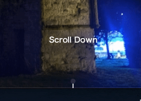
}棒線要素を作る
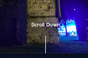
- .p-mainVisual__floatの擬似要素として作成する
- width:2px、height:60pxの棒線
- 背景色は#eee
/* 棒線要素 */
.p-mainVisual__float:before{
  content: "";
  position: absolute;
  width: 2px;
  height: 60px;
  background-color: #eee;
  bottom: 0;
  left: 50%;
  transform: translateX(-50%);
}
丸要素を作る
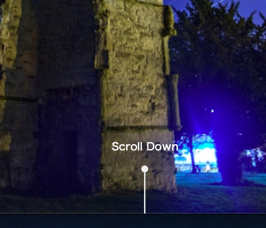
- .p-mainVisual__floatの擬似要素として作成する
- width:10px、height:10px、border-radius:50%の丸
- 背景色は#eee
/* 円の要素 */
.p-mainVisual__float:after{
  content: "";
  position: absolute;
  width: 10px;
  height: 10px;
  border-radius: 50%;
  background-color: #eee;
  bottom: 60px;
  left: 50%;
  transform: translateX(-50%);
}
アニメーションをつくる
まずは丸を上下に動かしてみる
- animation-name → @keyframesの名前と紐づける
- animation-duration → アニメーションの長さ
- animation-iteration-count → アニメーションを繰り返す回数
- animation-timing-function → アニメーションの移動速度
/* 円の要素 */
.p-mainVisual__float:after{
  content: "";
  position: absolute;
  width: 10px;
  height: 10px;
  border-radius: 50%;
  background-color: #eee;
  bottom: 60px;
  left: 50%;
  transform: translateX(-50%);
  /* animation */
  animation-name: circle;
  animation-duration: 1.5s;
  animation-iteration-count: infinite;
  animation-timing-function: ease;
}

@keyframes circle{
  0%{
    bottom: 60px;
  }
  100%{
    bottom: 0px;
  }
}
円が下に移動するに連れて透明に
- opacityを1→0に
@keyframes circle{
  0%{
    bottom: 60px;
    opacity: 1;
  }
  100%{
    bottom: 0px;
    opacity: 0;
  }
}
棒線も丸の動きに合わせて短くする
- heightを60px → 0pxに変化させる
/* 棒線要素 */
.p-mainVisual__float:before{
  content: "";
  position: absolute;
  width: 2px;
  height: 60px;
  background-color: #eee;
  bottom: 0;
  left: 50%;
  transform: translateX(-50%);
  /* animation */
  animation-name: line;
  animation-duration: 1.5s;
  animation-iteration-count: infinite;
  animation-timing-function: ease;
}

@keyframes line{
  0%{
    height: 60px;
  }
  100%{
    height: 0px;
  }
}